Today, we’re launching a new logo and product redesign, as we start to refine the app in general. We’ve been working on these updates for the last several months—all towards the goal of making the app more consistent, easier to navigate, and ready for years to come.
Note: All of the features and functionality of Booqable are still here. You still have access to everything you had before.
Why a new look?
We think the old Booqable worked nicely, and know many of you felt the same. And yet, here we are to explain why we decided to change things.
Firstly, it’s more than a fresh coat of paint. We all like apps that look good, and it’s part of the experience of using them. But appearance isn’t a good enough reason to redesign a product. A good reason to redesign a product is that it’s not entirely working the way you want. And because a simpler, more structured version could perform better.
Our original design dated back to our launch five years ago, when Booqable was an uncomplicated, organized place to get things done. But as we added new features and released updates almost every month, we knew these developments needed a place to live, and a place for you to set them up.
After hundreds of customer conversations, we realized Booqable started to become cluttered, and getting started could feel overwhelming. Even long-time users sometimes struggled to find specific settings, or navigate the app. For us, this was a proper justification to redesign Booqable. So, here we are, celebrating the new design and sharing what’s new.
What’s new?
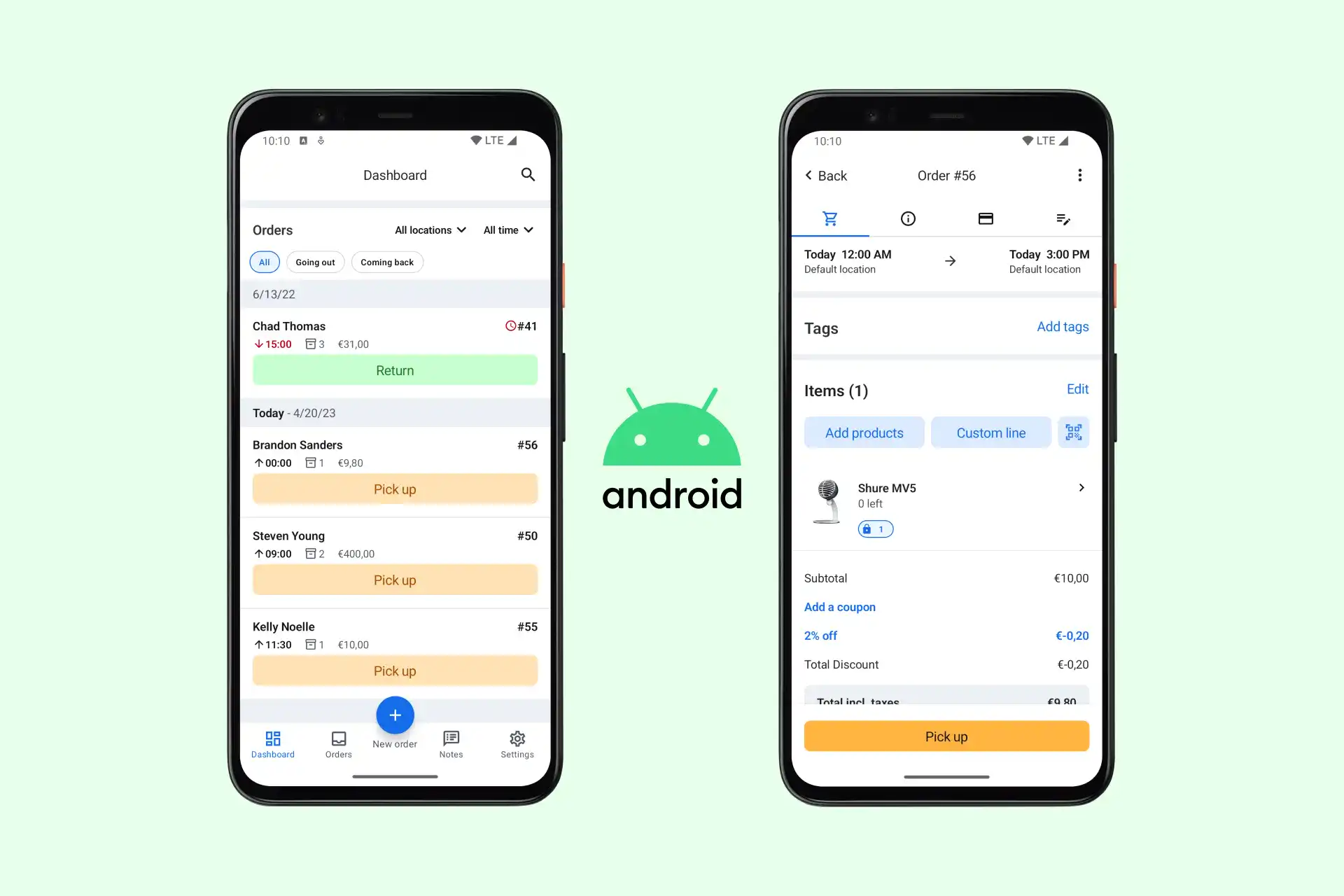
A sensible place to start was our left navigation menu. With so many updates throughout the years, the left panel now contained 12 icons—nine at the top and three at the bottom, without a well-defined structure. We worked to rearrange the menu so that it’s organized and easy to grasp. A picture is worth a thousand words, so let’s cut to the big reveal:
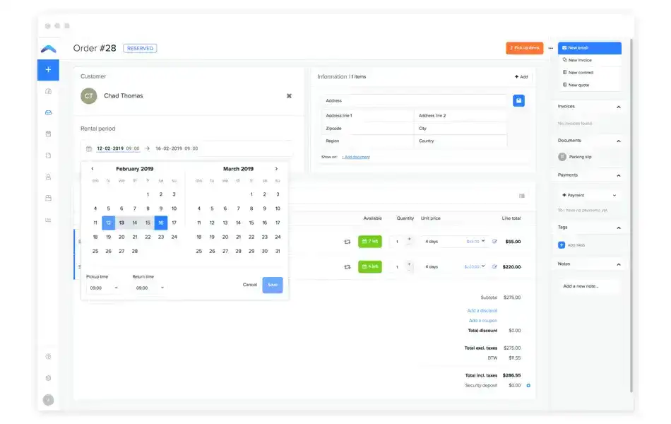
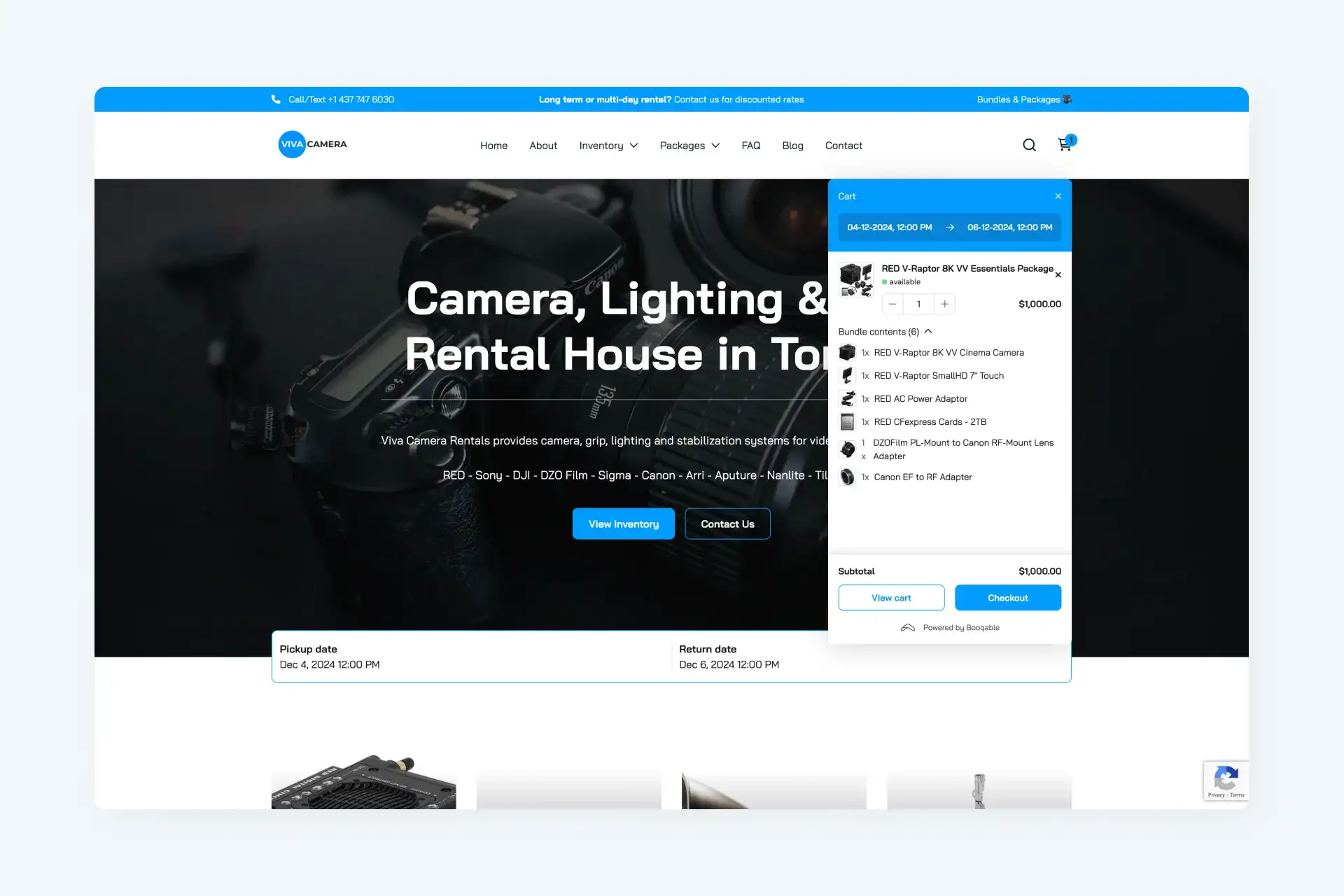
We decided to bring back the shortcut to create a new rental order and grouped the parts of Booqable you most frequently use: the Dashboard, Orders, and the Calendar. Below, we created a separate segment for Documents, Customers, and Products, followed by Reports and Settings, which require fewer visits once you’re up and running with Booqable. It’s a more sensible hierarchy.
Another confusing part of Booqable was the add-ons section. While perfect for adjusting Booqable to your rental company’s needs, add-ons made prominent features hard to find. You can now find some of these toggles in your settings, and some we enabled by default.
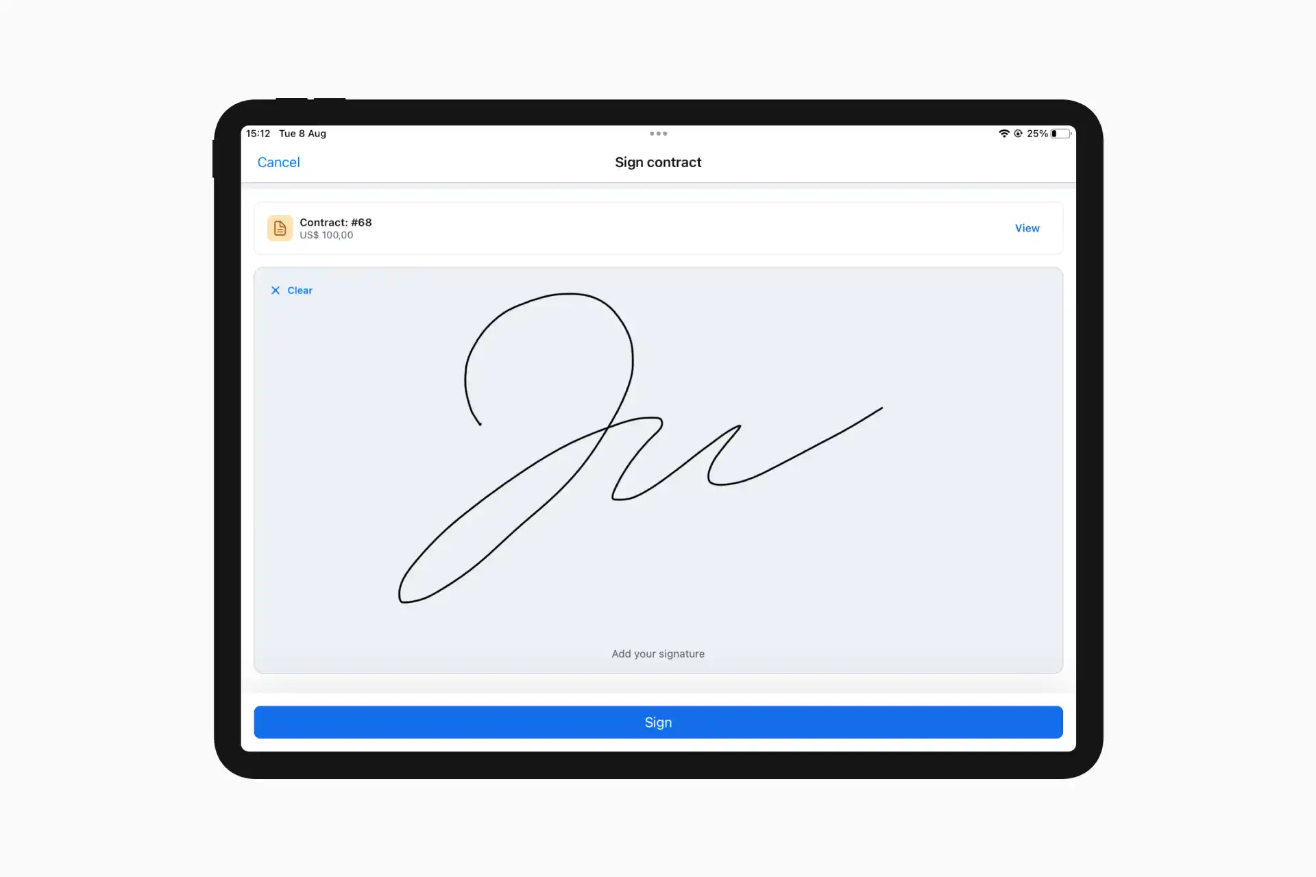
Lastly, we made changes to the color palette of order statuses. They worked pretty well before, but not all colors aligned with the true meaning they represent. The important thing about statuses is that whenever you see them, you instantly recognize what they intend. And colors are a big part of that. Here’s what we changed:

The old palette used orange for showing that a product was unavailable, and for indicating an order had been returned (which in turn, made products available again). We’ve always found this contradicting. It was time to swap the colors of the ‘picked up’ and ‘returned’ statuses, so you and your team can see where things stand without any inconsistencies.
And how about that logo?
We grabbed this opportunity to evolve our brand as well. Our in-house designer worked to create a new and more playful visual identity which, we believe, is more instantly recognizable. The new logo represents the endless cycle of products that go out and come back again, similar to one of humanity’s oldest tools: the boomerang. Don’t be surprised to see new visuals on the website, in advertising, and some places in Booqable anytime soon.
![]()
Over the next few months, you’ll see Booqable become more consistent and easy to navigate, as we’re gradually releasing new features and improvements that make our product more cohesive and less cluttered. And because speed is one of our top priorities, you’ll also notice improved performance. A faster, more complete Booqable is right around the corner.
Long story short: We changed the logo and redesigned the app.
Cheers, the team at Booqable