


Just 20 years ago, it was hard to imagine a world where the internet would play such a vital role in our lives. Fast forward to today, and it’s hard to imagine a world without the convenience of the internet. As our devices have evolved, the way we interact with the world has also evolved. Mobile internet usage is now at an all-time high, and 79% of people make purchases on their smartphones.
What does this mean for you as a small business owner? Well, it means your rental website is more important than ever, and so is its mobile friendliness. Almost everyone uses their smartphones to accomplish tasks throughout the day: whether it’s social interactions, ordering groceries, or shopping for clothes. Indeed, this also includes making bookings from rental stores just like your own.
Why make a rental website mobile-friendly?
If your website is not optimized for mobile devices, it can be more difficult for your customers to make bookings conveniently. A non-mobile-friendly website may mean the user has to pinch and zoom to read the content, which is frustrating. It’s the number one reason people abandon websites and search for one that’s easier to use. The outcome of this is that you could be losing customers.
Google has found that 94% of people in the USA search for local information on their smartphones. This includes searching for cafes, restaurants, and places to rent what they need for work, vacations, and special events. It’s also interesting to note that 77% of these searches occur at home or work, where a PC or laptop is likely to be present.
Capturing mobile users is critical to your business because, as the numbers show, most people looking for your website are doing it on their mobile devices. This is even more important with Google revealing that there has been a growth of searches for keywords that include “near me” of over 200% in the last two years alone.
Start your rental business for just $29/month
Put your toes in the water and test the demand in your area with a rental website for just $29/month.
 Free 14-day trial
What should I consider when making my rental website mobile-friendly?
It should be easy for your customers
Your mobile website should make it easy for a customer to achieve their objectives. For a rental website, this could be making an online booking, searching, or finding information. The design of your mobile website should make it easier for customers to visit your website and complete the task, therefore driving up your revenue.
When thinking about achieving this, you should think about your customers’ journey and how they can do it as quickly as possible. This will mean streamlining their experience to reduce the number of interactions they need to make to complete your set goal.
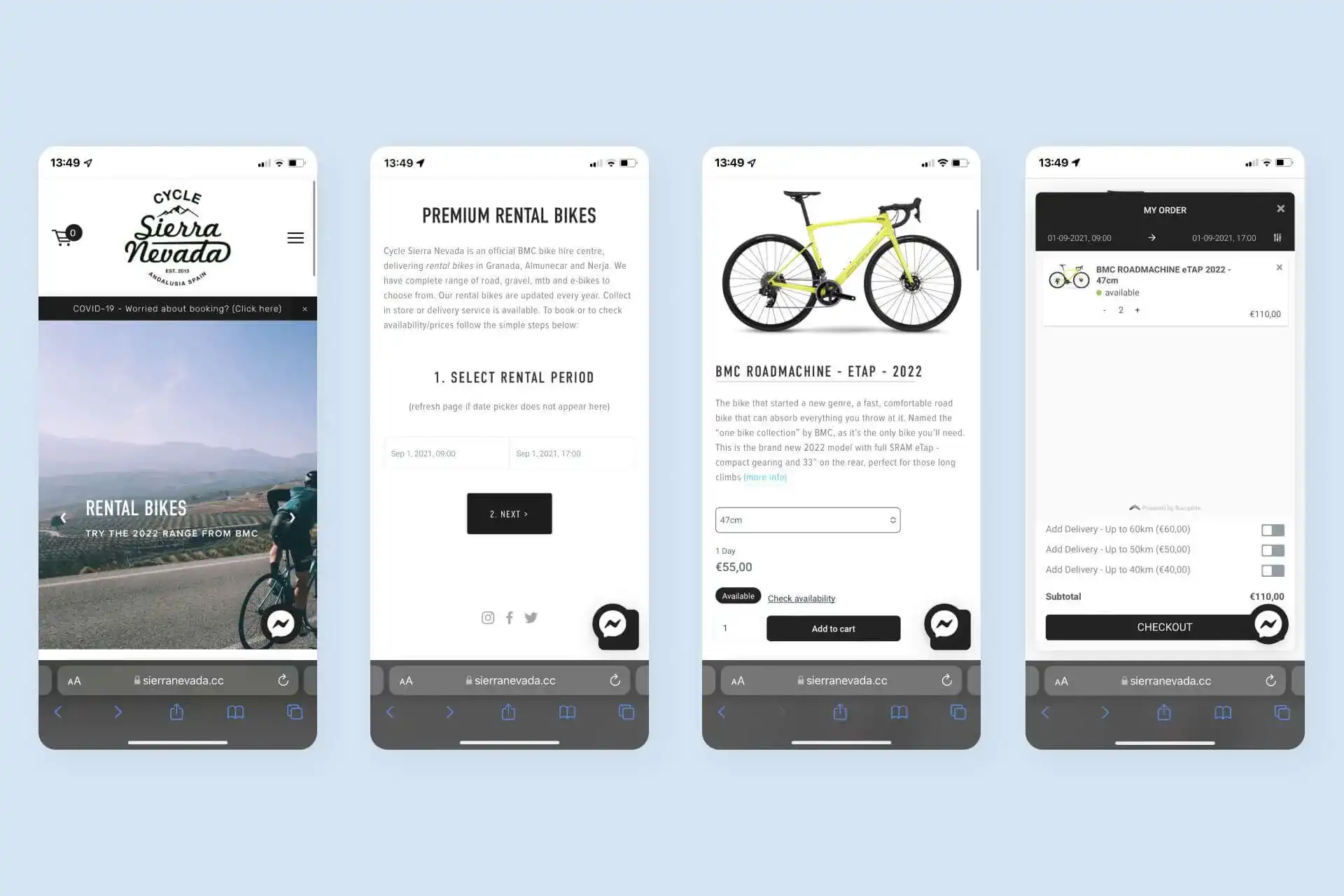
In this example:
- After searching for bike rentals, the customers arrive on the site and click the link to start a booking.
- They choose when they want to book a bike.
- They decided on the bike they wish to book.
- They check out and pay for their bike rental.
Measure how effective your mobile website is
To make a mobile website effective, it requires prioritization. This can easily be achieved by deciding the most important tasks for your customers who find you on their smartphones. Your mobile website should support these tasks easily, and way to measure the performance is to see how easy it is to complete them. Moving forward, your design can reflect these tasks and help you to create a consistent and responsive experience across mobile and desktop.
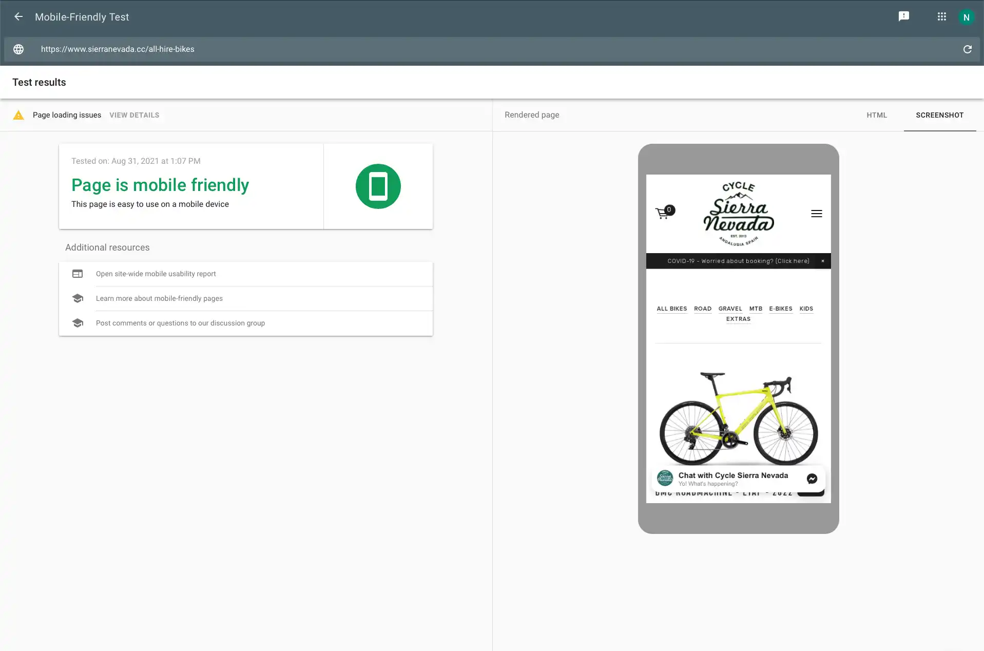
Google has a handy tool called Mobile-Friendly Test, which allows you to check if your website is mobile-friendly. If it is, you can pat yourself on the back; if it isn’t, you will be shown a list of reasons not. This can help give you an actionable plan for creating a better mobile experience for your customers.
Select a design/theme that’s responsive
The design of your website should be what’s known as “responsive.” This means that your website adapts to the display it is being shown on, rather than managing separate websites for desktop and mobile. So, when you are looking for a theme or commissioning a web designer, you need to look out for the word “responsive”; otherwise, it could cause you some issues.
Baines & Ernst used responsive web design to optimize their website instead of their older method that used separate sites for desktop and mobile. As a result, they found that visitors went to 11% more pages on their site and the number of visitors that converted to customers went up 51%. This proves the impact it can have on your website, and if your mobile experience is terrible, these gains could be much higher with a responsive web design.
Inspiration is everywhere
Remember that you don’t have to do this alone. Millions of websites have a responsive website design that you can take inspiration from. It’s unlikely that you will be the first in your industry to implementing it, but you can benefit from the best practices already developed. You can also learn from others in your industry and see what works best before you commit to any changes to your website.
Final thoughts
While the impact of having a mobile-friendly website has enormous potential in terms of customer experience and conversions, it can also help your website to be found by new customers. Since 2015, mobile-friendliness has been a significant ranking factor within Google Search, and you can be penalized if your website doesn’t cater to mobile. In fact, for the past couple of years, Google has prioritized mobile-friendliness over other ranking factors as the world goes ever more mobile.
So, if you’re creating your website for the first time or your existing website isn’t as mobile-friendly as you’d like, it will pay to change to a more responsive website. This could mean having a complete redesign with a new theme or bespoke creation, or you may have to hire a developer to make your website more responsive and improve the mobile experience.


